 Most people think the most important job of good design is to be pretty. Or clever. Or clickable. WRONG — and here’s an example of why:
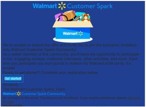
Good friend Ken Brown of The Solution Centre recently sent me this example of an email survey request from Walmart and asked for my opinion. I checked the link and yes, it really was from Walmart.
At first I thought Ken sent it to get my opinion on the marketing message, but I couldn’t read it, so I asked him what it said. He couldn’t read it either ― that was his point, and he wondered who was running theWalmart advertising division.
It’s a perfect example of how to mess up Design Rule #1: Make it LEGIBLE. (Especially if you’re an international brand.)
I’m pretty sure they got an abysmal response to their survey, making the whole effort a waste of time and resources. It also makes Walmart look incompetent. They may not notice any effect on their revenues, but a smaller business can’t afford this kind of glaring mistake.
So when you’re evaluating a design for an ad, a sign or any kind of outreach, make sure, first of all, that it’s legible. Your customers and your bottom line will thank you.